The Process Behind Sunrise Sushi
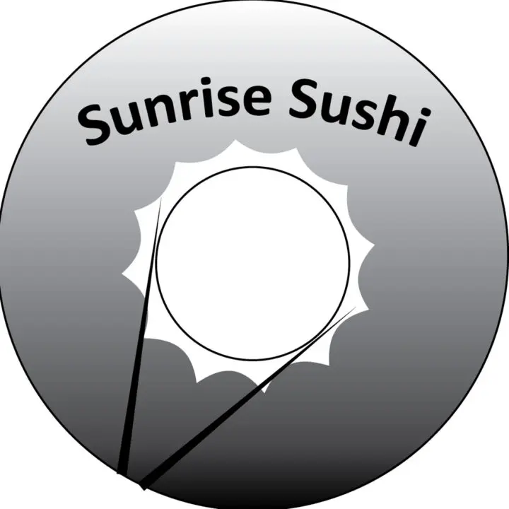
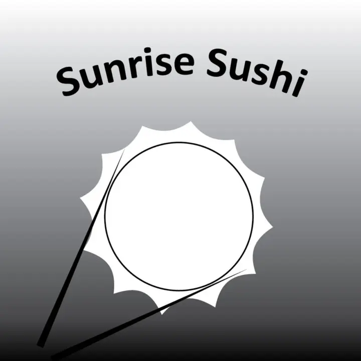
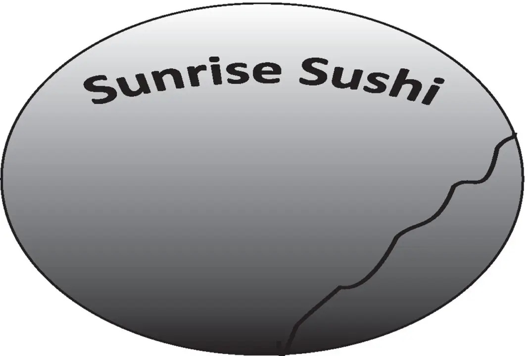
The original Sunrise Sushi logo.
Sunrise Sushi is a food establishment whose logo does not showcase anything culinary related. Redesigning this logo to associate it with a culinary institution does Sunrise Sushi a major justice.
The logo says it all: something sharp sticking into something round. Well, if you thought that, you were wrong. This is apparently a Japanese tea house in front of a rising sun and this logo represents Sunrise Sushi.
Sunrise Sushi is a local restaurant that serves elegant, unique and scrumptious Japanese fare, such as sushi, soup and tea. Without something memorable or easily recognizable, however, Sunrise Sushi is simply another sushi place.
Revamping this logo calls for something that attributes to the product being quickly identifiable, viewed in a positive light and distinguishable when viewed for a short period of time. The restaurant’s name and freshness of its products should be included in a revamped, modern and simple logo.
Proposals
Initial Proposals
When one hears the name Sunrise Sushi, many things come to mind. Sushi, fish, the ocean, sunrise, Japan – the list goes on. These items provide a lot of material to consider and take advantage of when considering a new logo for Sunrise Sushi. The six proposed logos below takes some of those aforementioned items and turned them into reality.
Proposal 1: Chopsticks grabbing a rising sun.
Proposal 2: Fish jumping out of an ocean.
Proposal 3: Chopsticks grabbing a rising sun.
Proposal 4: Grabbing a fish jumping out of an ocean.
Proposal 5: Modern rendition of grabbing a fish with chopsticks.
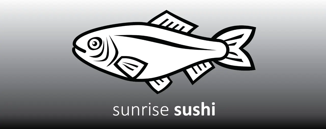
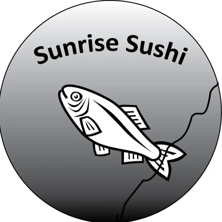
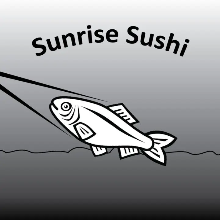
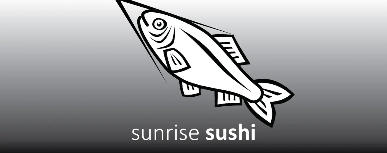
Proposal 6: Modern rendition of a fish.
Logos With Real Images
Including photos in the logo might have provided an extra kick; however, they have proven to be nothing but a nuisance. It does not print well either.

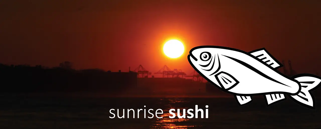
Proposal 1: Fish juxtaposted against a sunrise, jumping into the ocean.

Proposal 2: A fish jumping out of water, directly in front of the sun.
Proposal 3: A fish attempting to eat the sunrise.
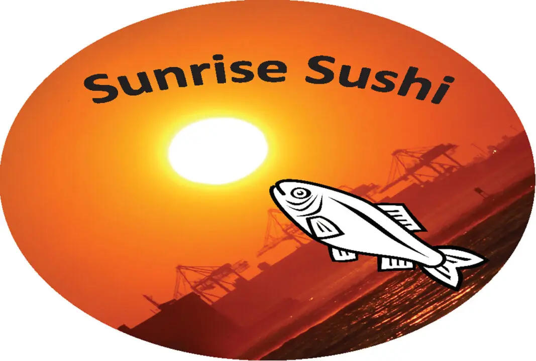
Proposal 4: Circular version of the logo, with a fish attempting to eat the sunrise.
Proposal 5: An empty ocean.
Logos Without Photography
Photography would have been a nice touch; however, there were more negatives to it versus positives. The decision was made to remove photography and stick with simple and modern design principles.
Seen here are six iterations of the new Sunrise Sushi logo. Reminiscent of the Japanese flag, a red circle has been added in the first two versions. The third and fourth version incorporates an image of a fish, meant to symbolize freshness. The last two versions incorporate an image of a sushi, simply conveying what the main product is. Each version includes a logo with chopsticks – an essential element in consuming sushi.
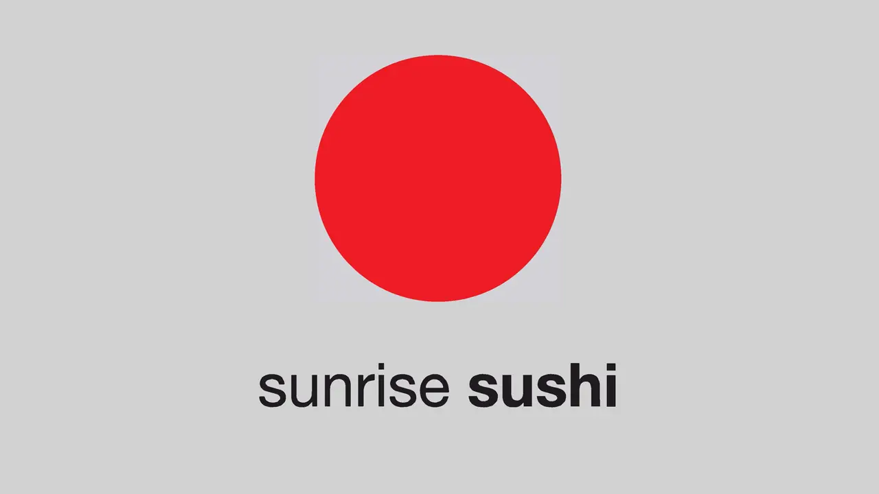
Proposal 1: A simple sunrise, reminiscent of the flag of Japan.
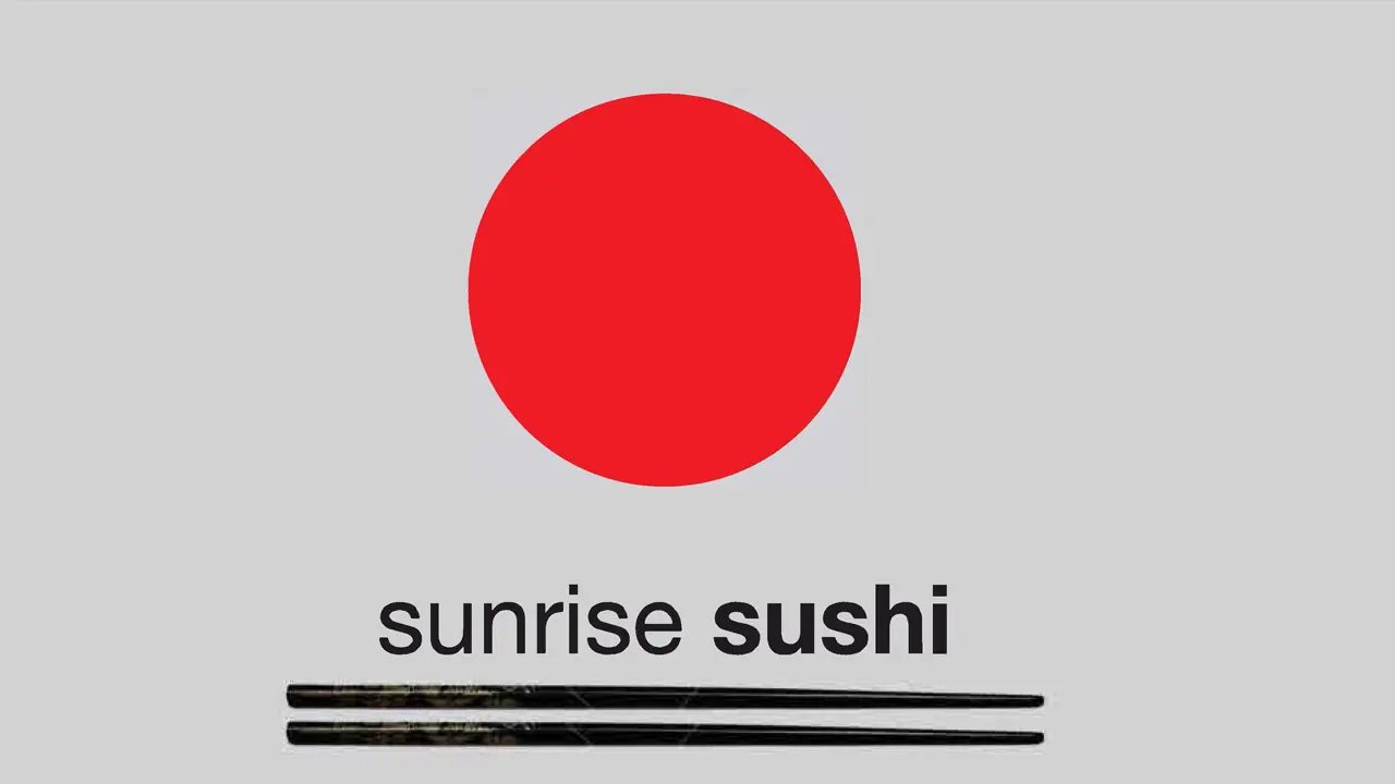
Proposal 2: A simple sunrise and chopsticks.
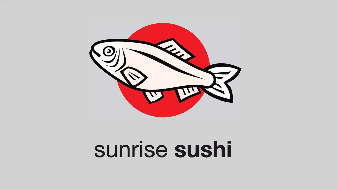
Proposal 3: A fish in front of a sunrise that looks like the flag of Japan.
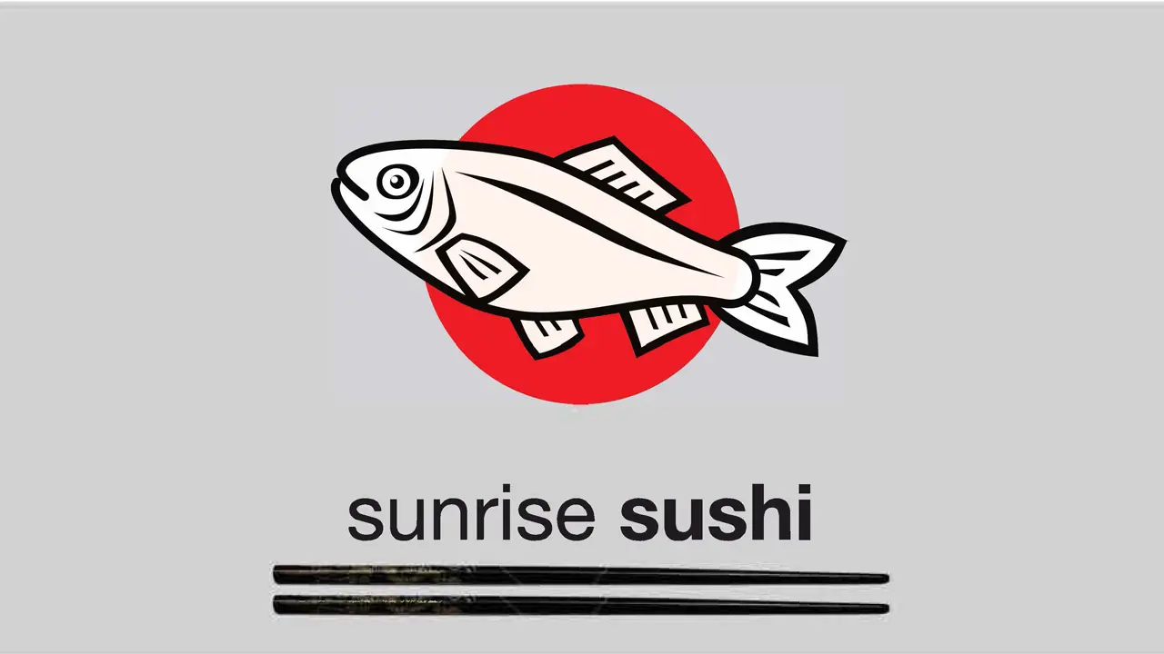
Proposal 4: A fish, sunrise, and pair of chopsticks.
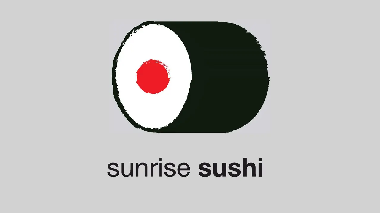
Proposal 5: A sushi roll. The center of the roll is red, reminiscent of a sunrise and flag of Japan.
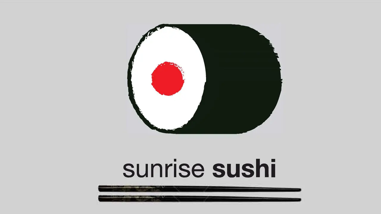
Proposal 6: A sushi roll and pair of chopsticks.