The Process Behind The Fake News Network Website
I have used the fictional Fake News Network (FNN) throughout my final semester of college to create many things such as a branding identification, website, twitter feed and an “on-the-go” version of the website. For the final project, I intend to bring everything together and create a comprehensive website that integrates all of these features. The website will feature “on-the-go” headlines, other headlines that are not as significant (accompanied by a corresponding picture) and a video function. However, since the headlines on the website will be constantly changing, I will be using the aforementioned branding IDs as videos. I am also producing a television show opening for this network and will integrate this into the website.
Unlike previous assignments, each story will link to a page where they can read more about the link they chose. Included on this page will be the title, brief summary, respective image and the story itself. These features will mimic the feel of a traditional news website, without being a traditional news network.
Tracery Writer, p5.js, Mousetrap, jQuery, and Bootstrap will be used for this project.
Potential Conflicts
The headlines will be randomized on the FNN home page. The problem will be getting those headlines to transfer over to the individual news story page without JavaScript loading a set of new headlines.
Concept Art / Screenshots

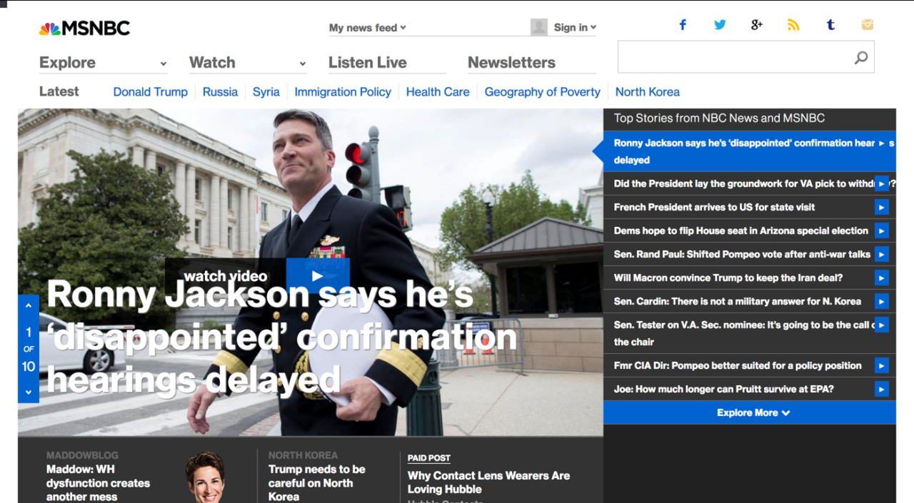
The top stories from NBC are shown here. This is a similar design to how FNN Express, where users get to see “on-the-go” headlines, would be.

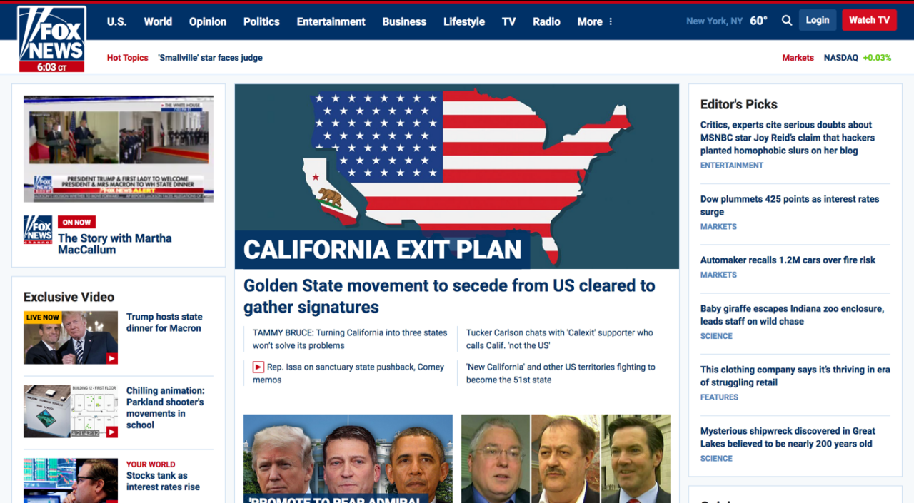
Fox News and CNN are extreme examples of how stories will be displayed on FNN. The goal of FNN is to be simple, so there will only be one to two columns of news, which won’t be a deal breaker for readers.

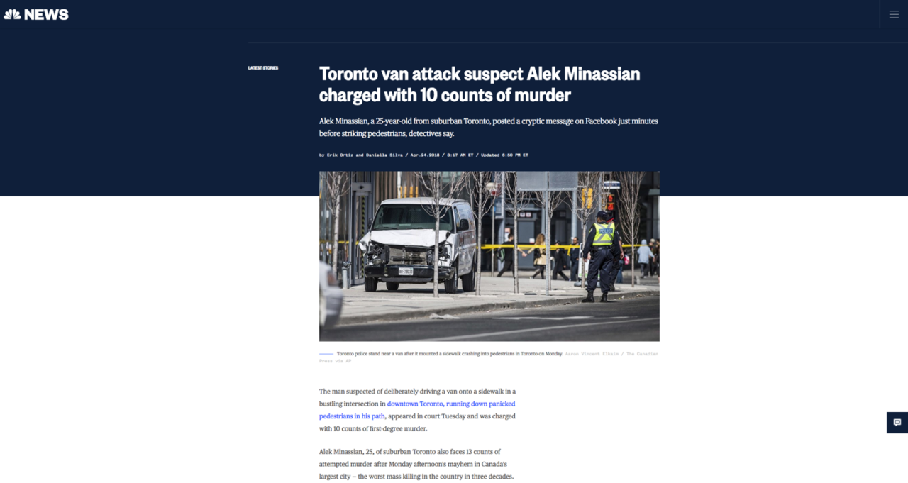
Following NBC’s lead, FNN stories will include the title, brief summary, image and then the respective story beneath. Nothing else, except the header, will appear. This is in an attempt to not distract the reader.
Users will:
- Find information about upcoming movies.
- Watch trailers for any movie in the database.
- Sort movies by category and find something for their needs
Fake News Network Version 1
Usability Test
Considering that the JavaScript for story and image generation has not yet been put into place, the Fake News Network usability test consisted of five users analyzing the website and its template. Five tech-savvy college students participated in this usability test.
Starting off with the homepage, users had several complaints. Generally speaking, no sort of information was dominant on the homepage. What was dominant, however, were the size of the images on the page. The remedy to this is to alter the proportion of the images so that it is wider and shorter. Additionally, the story title should be larger since there is a lot of empty space around it. Shifting to the categories of news, there is a lot of empty space surrounding the stories. While users do not want to be bombarded with information, two columns would be a better use of space. When scrolling through the page, the scrolling gets interrupted if the cursor is over a story and that is a definite nuisance.
Looking at the article page, users were generally satisfied with the display of the story. Having the article content contrast with the remainder of the page allowed for attention to directly go there. The page header, however, was not as pleasant due to the sizing of the image. This was similar to the homepage. The article page also lacked dominant content.
Users did not report any problems with the video page and significant work is left to be done on it.
Fake News Network Final Version
This update places an emphasis on text sizes, to make important material stand out. Additionally, comments from the Usability Test have been addressed.
